The Space & Beyond Blog
NASA’s logo: From meatball to worm and back
The story behind NASA’s famous meatball logo
After the Soviet Union launched Sputnik in 1957, the race was on for the United States’ own fledgling space program and in 1958 President Eisenhower signed the National Aeronautics and Space Act into law. While NASA was mostly focused on the Space Race in the years following their formation, the new agency also needed to create it official logo.
Wings were the spark
Before there was NASA, there was the National Advisory Committee for Aeronautics (NACA). This agency, which came into being after the first controlled heavier-than-air flight by the Wright Brothers in 1903, had their own logo: a set of wings.
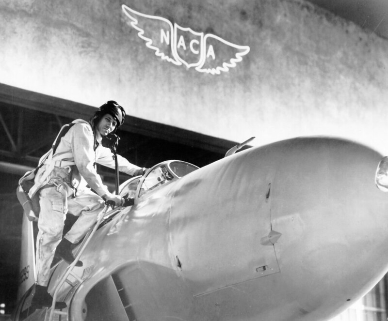
Founded in 1915, NACA was absorbed by NASA in 1958. Credit: NASA
Following its creation, NASA absorbed NACA and the chief designer of NASA’s now infamous seal and meatball insignia, James J. Modarelli, attended a tour of the NACA.
During his tour of the Ames Unitary Plan Wind Tunnel, Modarelli viewed a model of a radical supersonic airplane designed to reach Mach 3. He was impressed by the cambered and twisted arrow wing and upturned nose on the model.
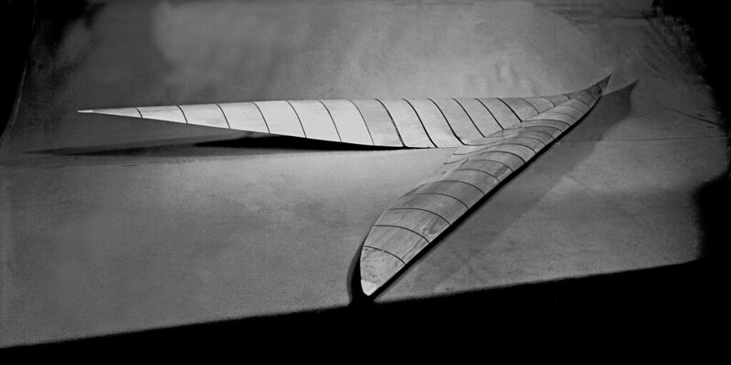
While touring the Langley Research Center, Modarelli was inspired by a display model of a supersonic wing design. Credit: NASA
A few months later he was shown another highly swept and cambered arrow wing model that was being tested at supersonic speeds. The seeds of Modarelli’s arrow-wing configuration seal design, now a key element of NASA’s insignia, were planted.
A design competition for NASA’s official seal began in September of 1958. In the end, Modarelli’s design was selected.
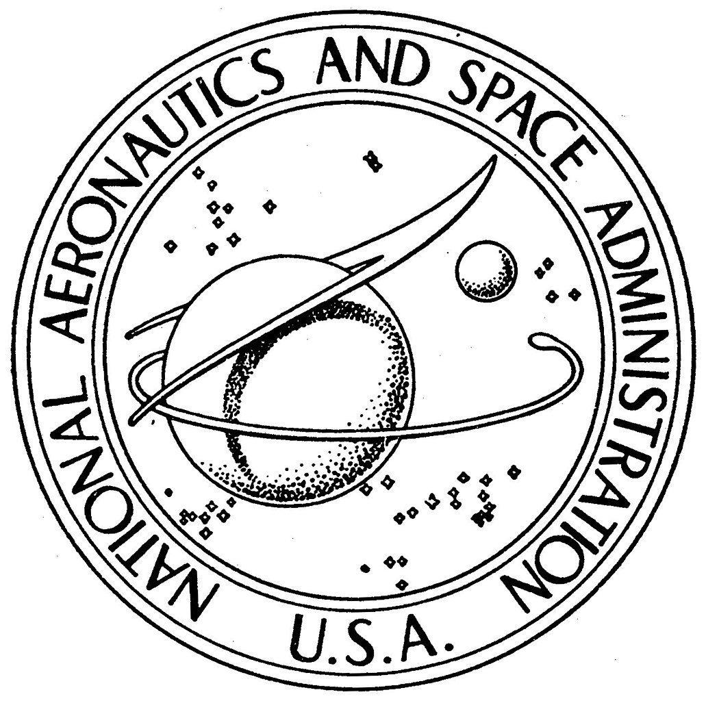
Modarelli submitted this design to become NASA’s first seal. Credit: NASA (James Modarelli)
An evolving seal
After Modarelli’s design was picked, NASA needed to acquire final approval from the president in order for the seal to be considered official. After minor adjustments to the design, President Eisenhower approved the new seal in 1958 describing it as such:
“On a disc of the blue sky strewn with white stars, to dexter a large yellow sphere bearing a red f light symbol apex in upper sinister and wings enveloping and casting a gray-blue shadow upon the sphere, all partially encircled with a horizontal white orbit, in sinister a small light-blue sphere; circumscribing the disk a white band edged gold inscribed “National Aeronautics and Space Administration U.S.A.” in red letters.”
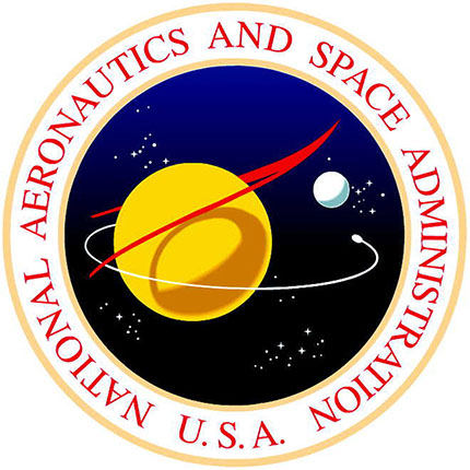
NASA’s official seal has seen its own changes over the years, with the Kennedy administration changing the background from gray-blue to brown in 1961. Credit: NASA
While he was finishing the official design, NASA’s first administrator also requested that Modarelli design a simplified version to appear on lapel pins and building signs. Selecting the main elements of his official design, Modarelli created the now famous insignia.
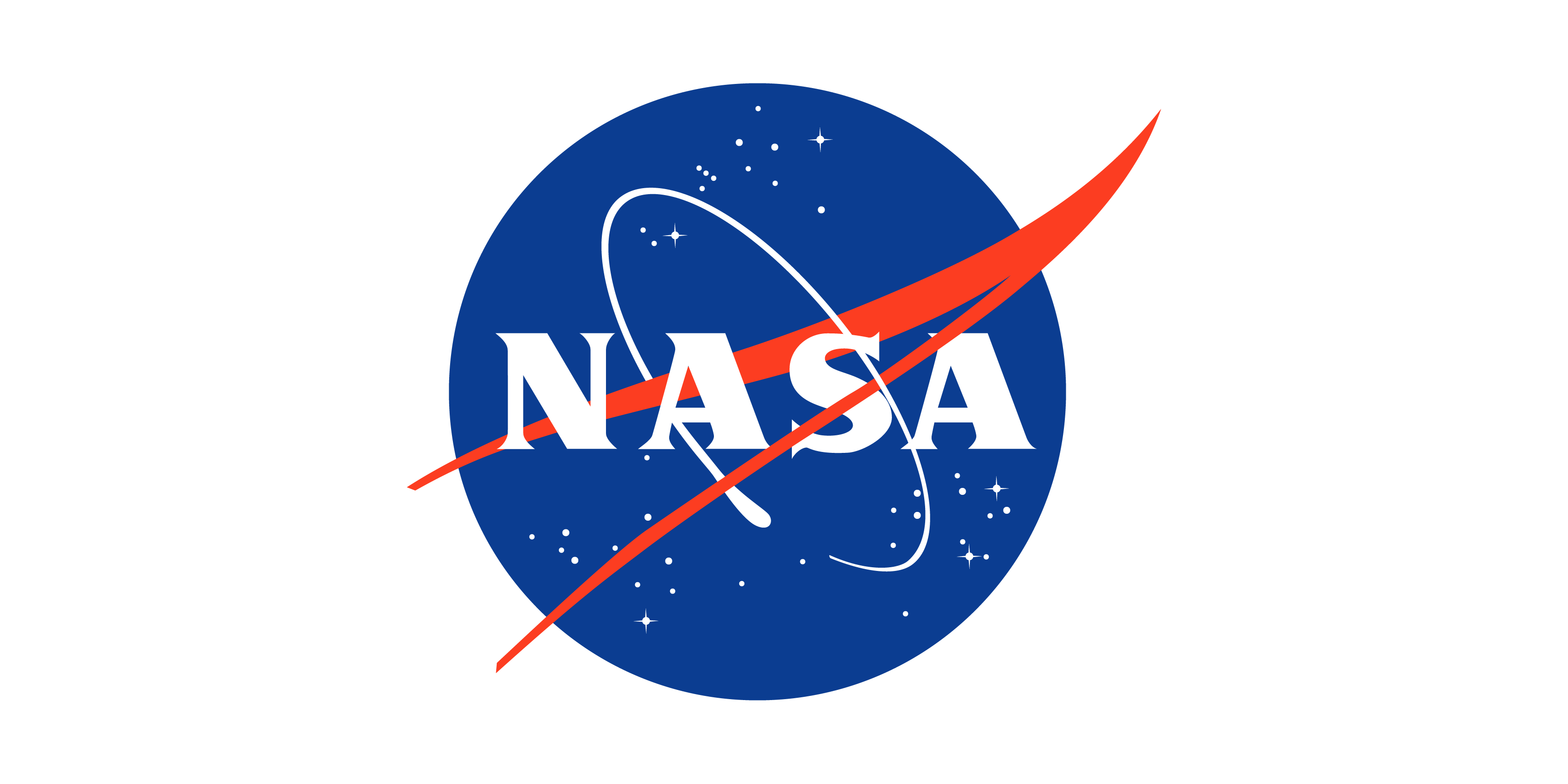
Modarelli’s insignia design was first dubbed the meatball in 1975 to differentiate it from the new logo. Credit: NASA
Modarelli’s creation remained the official NASA insignia for 16 years before it was replaced in 1975 by a more contemporary design. In order to differentiate the two, Frank “Red” Rowsome nicknamed Modarelli’s design ‘the meatball’. This new logotype, designed by the New York firm Danne and Blackburn, was a stripped-down version of the meatball, going so far as to remove even the As’ cross strokes. This new design was eventually given its own nickname, the worm.
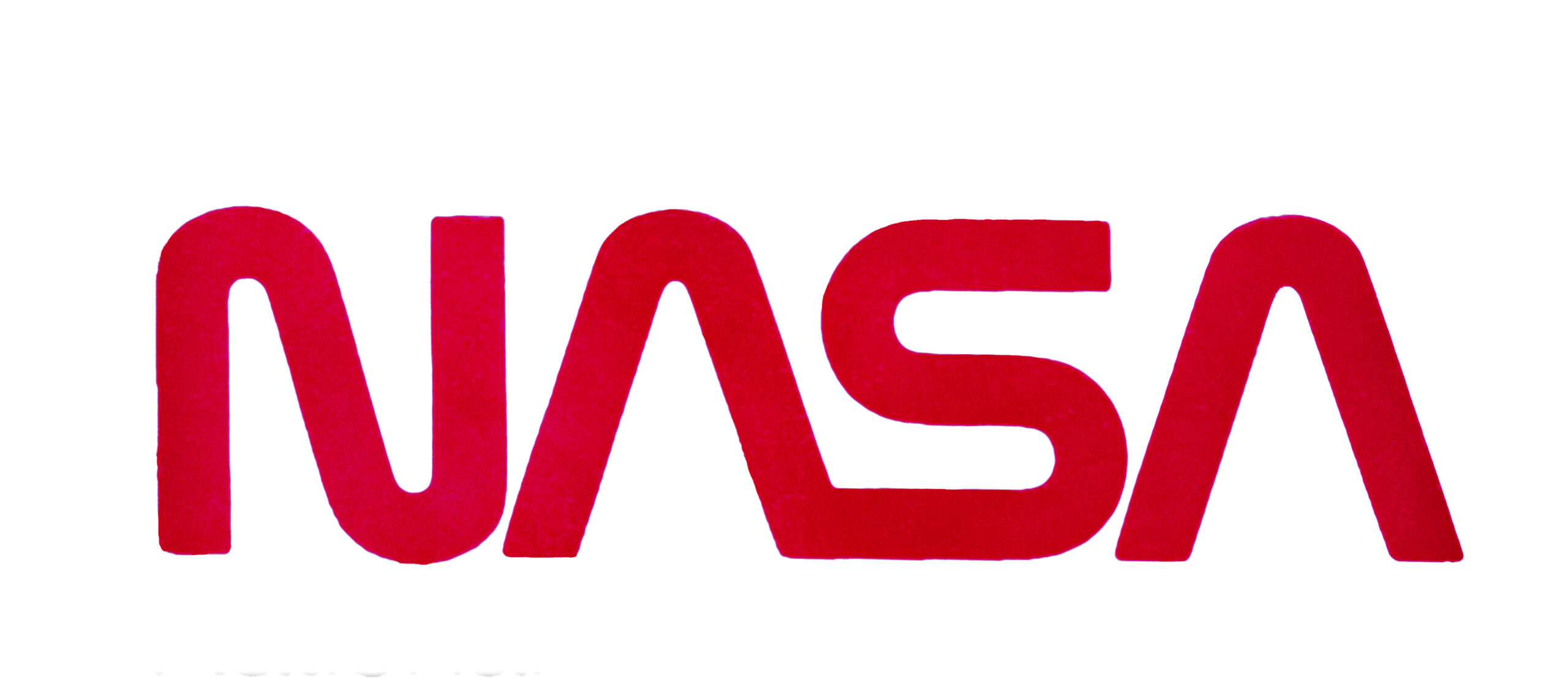
This new logo replaced Modarelli’s design in1975. Credit: NASA
Return of the meatball
In 1992, new NASA administrator Daniel S. Goldin arrived to his first tour of the Langley Research Center. Upon touchdown a fellow passenger turned to him and asked, “Why in the world do we have that awful logo?” Then, while touring the facility, Goldin asked what he could do to improve morale in the agency’s employees and Langley Center Director Paul F. Holloway showed him his special meatball stamped business card, explaining that that was the agency he wanted to work for.
In his first addressal of his new staff via NASA TV, Goldin announced the return of the meatball.
“Now let me tell you, we have a little surprise today. In honor of that spirit, it seems only fitting that the original NASA insignia—affectionately we know it as the “Meatball”—will be part of our future… Take pride in the symbol that stood for NASA excellence in the past—and now—looks to the world-class NASA of today and tomorrow…”
The decision, while popular, wasn’t without its criticisms. In an effort to make everyone happy, the unofficial “wormball” was proposed.
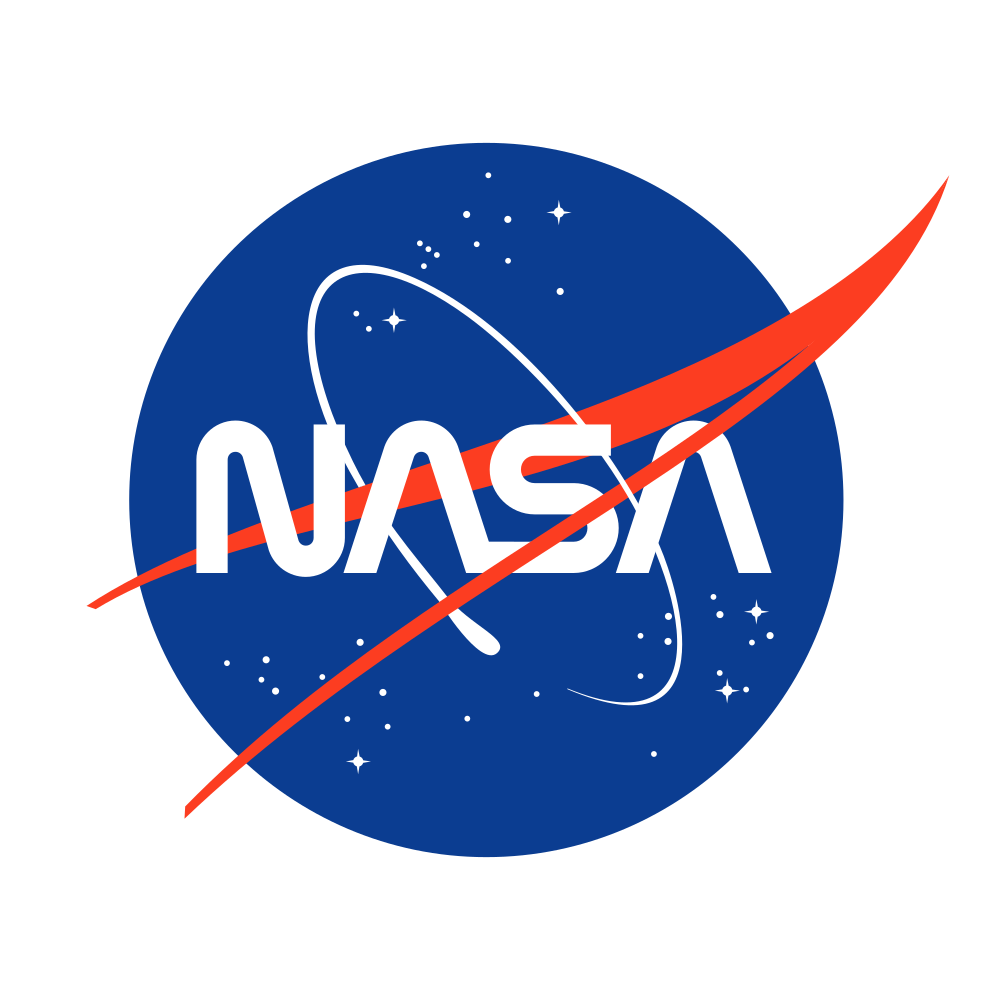
The so-called wormball logo combined elements from both the meatball and the worm. Credit: NASA (Dan Gauthier)
However, the wormball did not catch on and the meatball once more took over as the agency’s official insignia. The worm has made its own comeback recently as it was painted on the SpaceX Falcon 9 rocket that launched the Crew Dragon spacecraft to the International Space Station.
But don’t worry, NASA is quick to assure everyone that while the worm may appear more often, the meatball will remain the agency’s primary symbol.
Enjoying our blog?
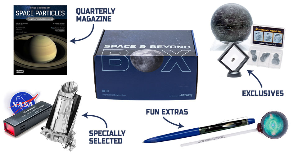
Check out the Space & Beyond Box: our space-themed subscription box!
CONNECT WITH US ON INSTAGRAM
CHECK OUT OUR LATEST BLOGS
Tour the inner solar system
Take a deep dive into the rocky planets that make up our local neighborhood.
